
This weeks case-file, 106:

As you can see it contains 2 colors I don't use very often and don't particularly like, the red and the peach. Now, I never plan my pages.... They just sort of come together. With this layout I almost forgot to use any red and peach at all, and I was so far into my layout that I had to think of a way to add these colors and not ruin this page I was already in love with because I didn't have the time to start the case-file again on a second layout. In the end I decide they would make the perfect accent colors, so I added a red side banner and glitter circles and a few peach flowers. The rest of the layout really focuses on the white, the sea foam greeny/blue and the yellow. It worked though and I couldn't be more in love with the final result. The only thing I didn't get right, was leaving enough space to journal without ruining the composition, so I have been a little old fashioned and written on the back of the layout, reminding myself of all those pics my Mom and Nan wrote on the back of!
'Night Now'

I know my title is a little hard to see, and that is because I chose to use the flair for my title.... It was just so perfect for the photo, which is one of my all time faves, and my testimony.
For the evidence I have used:
Gold: the Roman numeral for 4 is gold, and I also have a little gold dragonfly on my layout.
Numbers: I have used the Roman numeral for 4, this represents how many months old Jet was in this photo.
Circles: I have stamped white circles, and red glitter circles onto my background.
Stripes: Patterned paper layered behind photo.
White background: my background is white (obviously), though it does have a very faint pattern on it. I'm not a fan of lain white card stock as I can never manage to keep it clean.
For my testimony I have used all 3 inspiration words: Good, Bright, and Be.
My journaling states: 'I pray you will always dream good, bright and happy dreams, but just in case I will always be here to watch over you while you sleep.'
Here are a few ;-) close-ups:

I have painted a decorative chipboard frame with some white paint and placed it underneath my photo, but on top of some layers and foam tape just to give it a little more dimension.
Some gorgeous Prima flowers... The orange/peach one is just a cheapy white flower that I painted to match the palette.

I just love this decorative resin piece by Melissa Frances. I thought it looked kind of like a wave so I place the little wood veneer boat by Studio Calico on top..... He's sailing away to dream land!!!

My title up close! The pegs I have painted texture paste, then added glitter and some sparkle powder to it.

As you can see here my white background does have a slight pattern on it.... but hey... nobody said it had to be plain white right!!

My background was made using my new fave Prima stencil.... the netting one by Finn. I have actually turned it on an angle though and used it to create more of a grid pattern in my background. It was fun to change it up a bit and I now have to great designs to use from one stencil!! I have then added watercolors, another layer of texture paste through the stencil to highlight some areas, paint flicks, stamped circles (the red glitter to the small ones!), and stamping.
So the other week I was asked by none other than my Mom, why I normally put so many close-up pics up? You may have noticed my attempt to cut them down..... and so I thought I would just quickly share with you guys why that is. When I look at someones blog, particularly if I see something I really like, I hate it when they don't have close-ups of something I really want a closer look at to admire, or see how it was done. Sometimes, I really want to see the layers, or hidden tucked away embellishments, background details or just about anything else and there is just never the right photo to show me this. So I usually attempt to get all the details for you in my photos so that you can see these things that I don't like to miss. I have endeavored to get more details in less photos for you though.... I am still getting the hang of all this blogging stuff and I would love to hear from you what it is you want to see and read about when looking at blogs.
I realized on the weekend that it has been a very long time since I shared anything from my Art Journal with you.... mainly because I haven't done any journaling!! I bought a new journal a couple of months ago, a Prima one designed by Finn, which has been sitting on my desk all this time, not getting any use. I decided the New Year was the perfect time to open up a new journal and get creating. Today I am just going to share with you the cover.

I have to admit I am in love
with the way this turned out. It's different yet still me, and I have
been wanting to create a cluster like this for so long, but always felt
so guilty about using all my Prima stuff because its so hard to get
here, and once its gone its gone.
Close-ups:

I have used trinkets and beads from broken jewellery pieces, tiny washers, a chipboard arrow and a Tim Holtz pin on here, just about everything else is Prima. I love how well all these embellishments work together even though they are by different designers and from different collections.

I cut the title 'Create Memories' from some Prima packaging, while the made with love charm underneath is from an old bracelet, as are the two gold keys.

I have added the Le Mia rose to the center of a mechanicals bottle cap. Originally I wasn't going to add any flowers, but I loved how this flower had just a touch of color matching the rest of the cover in the center. Almost like it was meant to be there!!

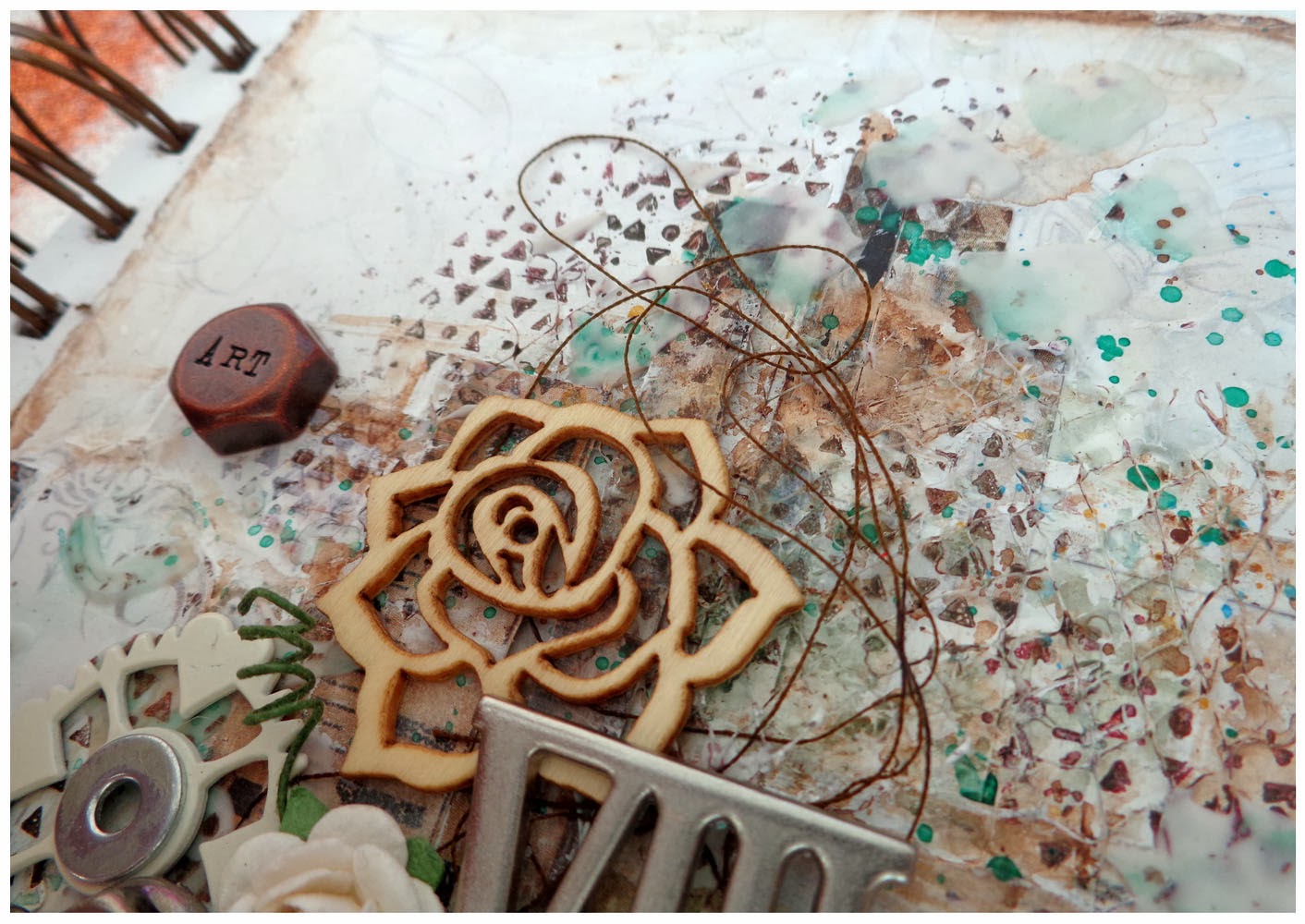
Here you can see some of the netting in the background along with the paint and paper layers. I really love how the background on this turned out. I have done something like this before but it never looked like this, mostly I was just experimenting to see what would happen!!

I have folded some brown cotton in half and just randomly twisted and twirled it down onto the background before gluing and embellishing. The little white gear sitting on top of the Prima tile is actually a little plastic mag off one of Jet's toy cars! It broke months ago and I decided to keep the pieces, thinking maybe one day I could put them to use. For a while I didn't think I ever actually would, but I'm glad I didn't throw them out as this one was a great addition here. Now I just can't wait to use the rest!!
That's it from me today... I'm off to rest as I have been quite unwell these past few days. I hope you have enjoyed today's post and that you have found something here to inspire you. I wish you all a fun and creative weekend!
No comments:
Post a Comment
Thanx for stopping by and for taking the time to leave your lovely comments.... xoxox!!!