Saturday, November 30, 2013

SUMMERTIME SUNSHINE....

Hi again! Hope everybody is having a good weekend? Mine has not been to bad, although it is unfortunately raining right now.... yes my post title has nothing to do with the actual weather but the lovely colors on the layout I have to share today!! I'm actually surprised I found the time to make this page today as my Mom and I went out Christmas shopping nearly all day.... We didn't get home til 4!! Maybe it's because my Son is spending the weekend with his daddy. I hate it when he goes.... he's still so little and I miss him too much. It gives me time to do some things though.... like this blog post!!
So today I decided that I really love yellow.... I brought a whole heap of clothes for Christmas that have yellow in them, a gorgeous fluro yellow.... and I decided I would participate in the ScrapFriends current Yummy Scrap color challenge... all because of the yellow!! It's a little strange because while I use touches of yellow in scrapbooking occasionally I rarely make it the focus of a page and I have never liked yellow clothes before.... I won't complain though because the clothes look great, and I love my layout! Check out ScrapFriends Yummy Scrap challenge here. It's totally stunning and the design team work is fabulous! You will not be disappointed!!

The color palette:


Before I get to sharing my creation I have to mention that I couldn't work out whether that top color was meant to be a blue or a medium grey so I have gone with the latter and the last two colors look identical on my computer so I've gone with black and chocolate brown (like the rim of the bowl).... anyway I hope you like what I came up with!!

'You Grow Up So Fast'


As you can probably tell the background is shiny. It was actually the packaging from Pink Paislee's Mistables collection. I've cut the top off and a little from the edges, added texture paste and watercolor (I didn't use gesso because I really loved how the watercolors came up on the raw background), and distressed the edges, adding some tears here and there.
I used my Winsor and Newton watercolors lemon yellow and cadmium orange. They are very vibrant and you only need the tiniest bit as they have a lot of pigment.

Here is what the background looked like before I added papers and embellishments:


Behind my background I've added a sheet of chocolate brown paper, helping to make the distressed edges and tears really stand out. It also makes watercolors pop.
 
Some close-ups:
 
 
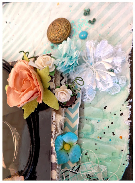
Lots of Prima flowers, along with some AC, Echo Park, Pink Paislee, Studio Calico, and Tim Holtz. There are a few other brands here as well.


I totally adore the black Le Mia rose from Prima. The grey ones are fantastic too, but black is rare and therefore beautiful. Besides it's a perfect match for this color scheme.
 
 
A Collections Elements butterfly and a little wood veneer yacht by Studio Calico. I even managed to find some funky bright yellow paper flowers, by Prima, in my stash. It took a little searching though as I have a cookie jar full!!
 
 
I have had this Kaisercraft mask for a few months now and I've only used it once before, which was on an art journal page I completed last month, I think! I really like it so I believe I will make an effort to use it more often!!
 
 
I cut a frame from a sheet of acetate, then cut it in half, placing one each on opposite corners of the photo. For my little twine frame, I actually unraveled some twine. I had planned to use my black waxed twine, but unfortunately I ran out, and oddly enough my yellow baker's twine looked horrible on here.... My next best option?.... Unravel some baker's twine and just use white. I really like how it turned out!!
 
 
It's been a while since I used Thickers on a layout.... I have so many that I never use, along with loads of alpha sticker sheets. I tend to have my fave's that I use on almost everything, while the rest gather dust. It was nice to change things up a bit.
 
 
I really adore this bright yellow arrow, though I was a little disappointed because something stuck to it and tore off some of the color leaving quite a large white patch. In an attempt to fix it I painted the missing section with yellow paint. In the end however, it was still quite noticeable. I was tempted not to use it but I liked it too much. In the end I placed the little bike over the patch and then tucked it behind the Prima flower. Now you can barely tell it's there!!

That's it from me again today, though I will be back early in the week with a few things to share, been working on a few little projects!! Don't forget to pop over to the ScrapFriends blog (You can find the link at the top of the post) and check out the current challenge, DT work and other entries. Thanks for stopping by and I hope to see you back again soon!
Have a lovely weekend everyone!!! Xoxoxoxox!!!!!


Monday, November 25, 2013

TREASURED MOMENTS

Hello again.... Sorry I haven't posted in a while. With Christmas just 4 weeks away and so much to do I've been struggling to find the time. The last 2 weeks have been spent non-stop Christmas shopping, cleaning, and more shopping. My gorgeous little boy has also decided that he doesn't want to have day sleeps anymore... which is when I used to scrapbook and blog. I would have loved him to continue with day sleeps until he was at least 3 but it's not the end of the world..... just a change in routine that I will eventually adjust to.

So remember how I was waiting for a delivery of products, mostly Prima to arrive? Well they finally have!!! I purchased them probably 2 months ago from the US, and I was beginning to wonder if they would ever arrive, so when they finally did arrive..... well I guess you could say I was acting like a 2 year old who couldn't wait 1 second to open his new toys and start playing with them!!!! It was the largest amount of product I have ever purchased in one go, consisting of many different brands, papers and embellishments, and lots of Prima flowers!! Some new and some older but all so gorgeous that I had such a hard time deciding what to use. In the end I mixed and matched..... I even cut up one of my new vines which I was loath to do, but am so glad I did. Here is what I came up with.....

'Treasured Moments'


I have used quite a few different brands on here MME, Studio Calico, Pink Paislee, Glitz, Tim holtz and lots of Prima!!!! 
I love this page, it would have to be among my favorites, the photo too!! The background was done with gesso, texture paste, watercolors, mists, glitter and embossing powder that is not heat-set. I've added a few little seed beads to the background too.

Detailed shots:


As always I have used lots and lots of layers and dimension on here.
The big white metal bead is actually from an old necklace that broke. I have had it sitting in my little container of bits and pieces for almost a year, though I've never used them. They were a perfect finishing touch to this layout though, so I'm glad I kept the necklace and didn't throw it out!!


I love Prima vines.... though I must admit in the past I have always had difficulty making them look right on my page. This time I decided to cut it into 3 pieces. The first of which you see here, wrapped around another Prima vine with small orange flowers. I spent quite a while fiddling with these two!! Twisting them together until I was happy with the way they sit. I've also added a little white rose underneath.


You can see some of the dimensions really well, especially from the flowers.
The title is made up of Glitz alphas which I have outlined in gesso using a fine brush.


As always, my photo has been framed with twine, and layered on paper and calico.
I have added another small flower cluster to this corner of the photo to help balance out the page, placing one of the small white roses inside one of the small bottle caps from Finnibair's Mechanicals collection. The big bronze button is also Prima.


These here are some of my all time fave Prima flowers!!
I'm also really loving these Tim Holtz memento pins, and Pink Paislee's artisan elements. This one I have cut in half  so more would be visible behind the flowers. I also have not lined the two halves up straight..... They look great off center from one another!! 


My page wouldn't have felt complete without the pegs, and of course at least one wood veneer!!! I also decided to add the little badge/flair. The color and pattern perfectly suited my style and how could I resist the little hand pointing to my son and I saying 'This'. It explained everything I was feeling with one word!!!


Finishing touches on my page included adding some smaller flowers behind the top corner of the photo and underneath the vines to help show the dimension better, enamel dots and the cork chevrons!!


You can really see some of the shimmer here, little seed beads and glitter too!!
Another bead from my necklace, an MME brad, and the Prima Shabby Chic metal treasures lamp added the finishing touches to this side of the page.

Well that's all I have to share today, though I know that was a long post for just one share!!! It's all the close-ups!!! I hope you found some inspiration here today though. I will try and be back to share with you again sometime this week, though with Christmas coming up and so much shopping to do I won't make any promises.
I hope you all have a great week!! Thanks for stopping by and kisses and hugs for the lovely ladies who leave me some comments!!! Xoxoxoxox!!!
 

Thursday, November 14, 2013

ANOTHER CHALLENGE CREATION....

Hi!! So I'm back again with yet another creation created for a challenge.... this one was created once again for CSI..... Color, Stories, Inspiration, this time case file #97. I loved the color palette, although I wasn't too keen on the sketch so I have change it a little to better suit my style. The biggest change would be that I have used rectangle photo's and not circles.... I just don't do circles! I've also used up a lot more of my page. I have used photo's from the same shoot, which I also used a few week ago when completing Scrapfriends sketch challenge #18. Now I know the layouts kinda look similar.... I can't help that once I altered the sketch they weren't that different and that it's the same color palette that I used..... As for the photo's.... I had no choice but to use the same one's as they are the only photo's I have in a set at the moment. I have been slack in printing out new photo's!! So even though there are a lot of similarities, I did endeavor to make them as different as I possible could while sticking to the color palette and the sketch.  
Before I continue though I'm very happy to mention that my layout 'Your so Fascinated Baby' was featured on the Most Wanted List on the CSI web-site this week. Thankyou everybody at CSI who made this happen. So exciting!! You can view the other case files, Design Team work, other entries and much more here.

Here is case file #97


 For the Evidence I have used  a patterned background, leaves (well I have used a leaf), I have added a twine frame behind my photo, calico behind my photos, wood venners and wooden pegs, the brown paper is wood-grained with a white chevron pattern on, the crystal palace vines from Prima are shiny, they are also transparent as is my skeleton leaf.
For my Testimony I have used all the Inspiration words, though I have used 'brighten' instead of 'bright'.

'Take a look'


For the title I have used a wood veneer which I have placed above the bows.
As always I have used gesso, texture paste, a mask and watercolor paints on my background, though in places they have blended together to make some different color greens and blues. I love it when my paints do this.... it is such an awesome effect!! While the page was still very wet I have turned it up all different directions to let it run. 

A Tip: Always, always, always coat your paper with gesso before adding watercolors to it. It only needs to be the thinnest layer... but if you don't do this your paint's won't come out as vibrant, you wont be able to mix the colors on the paper without taking the top layer off, and they will soak in very fast so you will be unable to spread the paints and get the drips.

Some of the brands I have used include Prima, Studio Calico, Echo Park, AC, MME, Pink Paislee and My Little Yellow Bicycle.

Here are some close-ups for you:


I have followed the sketch as best I could. I have included the side banners behind my photo, and I have cut chevrons from patterned paper, which I distressed before sticking to the page facing outwards.
 
My journaling says.... 'Oh, Baby'.....
 
 
I kept my journaling short this time round because sometimes you can say more in just a few short sentences than you can with a thousand words.
 
 
My title.... small I know, but I really love small titles... it suits me. Once again trying to follow the sketch I have placed my embellishments to run between the two photo's..... from one side to the other. My title and journaling are also in the same place as they are on the sketch. 


I hand-made the pinwheel with a sheet of paper from Christy Tomlinson's 6x6 She Art paper pad. I made 2 pinwheels, then glued one on top of the other to get the 8 points. I'm really loving sequins on layouts at the moment.... So sparkley and effective!!
 
 
Another pinwheel, though this is just a normal one!!! How cute is that little cloud on the veneer??... I had to use it, it was far too adorable to pass up!!


I added the flair thinking the amount of time my son moves around in a day.... over the space of a year he could easily circle the globe!!! I have also added the chipboard arrows to the photo's, 'pointing to each' in turn. I have covered the chipboard with black Kindy Glitz.
 
I had lots of fun making this layout... It was a challenge and I enjoyed it... and if I didn't already say this the color palette was to die for!!!! So that's it from me today. I probably won't be back until next week though I will try to stop by with something over the weekend.
Thankyou for stopping by and for taking the time to leave your comments!!! have a good week/weekend everybody!!! Xoxoxox!!!

Tuesday, November 12, 2013

GOTTA LOVE ME

Good morning once again, as promised!! First off though I'd like to say thanks to Scrapfriends and the design team. I'm so excited to have been a winner for sketch challenge #18. I'd also like to wish the other winners a congratulations and say well done to all those who entered, all the layouts were beautiful.

As you all know I have been doing lots of challenges lately, so I decided I would have a little break, even if only for a few days, and create a few things just because I can. So on the weekend I sat down and went through all my photos, choosing one that is very special to me. I also went through all my papers and products choosing some of my favorites to use on this page. I even used red... yes I know I shared a couple of pages just last week that had red in them, but they were made for challenges...... I have never used red on a page by my own choice... until now that is!!! I didn't use a lot of red though, just a touch, and I really love this page. It's so bright and fun and the colors remind me of my son's personality!!!


'Gotta Love Me'


For the background I have once again used my feather stencil with gesso, texture paste and watercolor paints. One of my favorite parts of this layout is how the feathers and the paint drips go up the page instead of down.... It is such a cool effect.
For my papers I have used a combination of AC, Cosmo Cricket, MME and Echo Park.

Some close-ups:


As you can see here I have once again created a frame for my photo using three different kinds of twine. I love the effect and texture this gives. 
For my cluster I have used some Prima flowers and junkyard findings, Tim Holtz pins, Studio Calico wood veneer, a flair from Shopevalicious, while the little black acetate heart and the butterfly are by Collections Elements..... All my favorite brands!!! And how cute is that little bee brad??? I have also added buttons, thread, black mesh and of course my pegs covered with black Kindy Glitz!!


Lot's of paper layers and calico as always. The little blue chipboard star is from Echo Park.
I chose to add the little wood veneer saying 'over & over', as this photo was taken shortly after my son learned to walk without holding onto anything. He was about 11 months old in this photo and it is one of my favorites. When it was taken he was standing at our back door. Now that he could walk all he wanted to do was go outside and every five minutes he would walk to the door and try to get out!! Unfortunately at the time I couldn't allow it due to our dog Missy, who sadly we had to give away. My Son plays outside all the time now..... He loves it out there!!


I love how bright my watercolor paints are, even when they mix together they never go muddy like some mists do. As you can see here I've torn the paper and folded it back to show the pattern on the other side. This actually wasn't intentional.... It happened when I was distressing the edge of my papers. I decided I liked it though and have tucked the little blue flower by Kaisercraft into the tear as it felt like there was something missing from there. I've added another little mosquito too, although this one is a different color to the one I used on my last layout. I love how cute they are! Perfect for boy pages!!!


More black mesh, Prima flowers, ribbon, buttons and thread. 
While I would normally only add one punched strip of patterned paper across the page, here I decided to use two. I love the effect this created and think I will double up more often!! 


How awesome do all these colors and textures look??? I'm so glad I added the red.... I have always loved orange but not red and as I said before, I never add red unless I have too. Those challenges I did for CSI case file #96 last week really have made me more confident in adding red to layouts. A bright red anyway, still not keen on dark red.... lol!! Thanks CSI!


Another bug/insect brad, this time a frog!! I didn't actually realize that I had three on here until just now... lol!! A few sequins, another black acetate heart and acetate butterfly.
The little cork arrow is from Studio Calico. As you can see I have once again decided to use a sticker from the Babysaurus collection by My Little Yellow Bicycle for my title. I love them.... they are all so bright and fun, not to mention always perfectly describing my boy!!! Besides it saves me having to think up a new title all the time!!!

So that's all from me again today. Though I should have more to share again later in the week... Anyway I had better get going.... Dad will be home soon and wanting his computer back and I've still got a few things I need to do. I hope you all have a good week!! Xxoxoxo!!

Monday, November 11, 2013

HAPPY MONDAY!

Hi, hi!!! How is everybody? I sure hope you all had a great weekend!!!! I thought I'd quickly share with you today my layout that I created for ScrapFriends November sketch challenge. I actually made it early last week, but I completely forgot to share it with you. I really enjoyed working with this sketch. Feathers are the new trend right now, but so far I've not thought to use them myself... until I saw this sketch that is. It is amazing!!! You can view all their challenges, entries, tips, DT work and more on their blog http://blog.scrapfriends.com.au/.

Here is the sketch for this month:


Awesome right??? So I have changed a few things on here to better suit my style, including moving almost the entire design towards the left of the page as I don't do centered quite so well. My photo sits a lot higher up and I've used up lots of the page, but overall I'm really happy with the way this turned out.

'So Big!'


As you can see, for the feathers I have instead used a 12x12 feather mask to create a background, then added 2 handmade calico feathers. I created the feathers using the template by Leeann Pearce which was shared on the ScrapFriends blog recently. You can see the post here
In place of the strips of patterned paper running across the top of the page, I have instead used only one which I moved down slightly from the top before tearing the bottom edge and then punching. The side banners I have layered under my photo are meant to take the place of some of the strips on the right.

Some detailed shots:


Instead of the two overlapping circles at the top of the sketch I have simply made a tear, adding patterned paper behind it and then a butterfly underneath. I have added the two pegs to the side of the photo in the same place the sketch has the word 'HI', and I have added the mosquito where the button was on the strips of paper. I have however used quite a few paper layers behind my photo in keeping with the sketch.


The feathers in the background were created using watercolors, mists and acrylic inks, along with chunky glitter and sequins. I love wood veneers at the moment.... I use them on everything!!! Here you can see I have added the wood veneer saying 'Crazy Cool' to the bottom left of my photo, the opposite side of the saying in the sketch. This was mainly because I hadn't left enough room there for it and the page was better balanced with it here.
 

As you can see here I have added a flower cluster in the place of the circle at the bottom of the photo. As always my page has to be full of clutter or it doesn't feel complete. More is always more... right???
I have used Prima flowers, Kaisercraft mini blooms,The Pink Paislee artisan elements, Studio Calico bow and wood veneers, a Tim Holtz light bulb, ect....


To make these feathers I first printed out the Leeann's feather doddle template and cut out the feathers I wanted to use. Then getting some plain card I glued some calico to it, smoothing out any wrinkles as I went. When the glue was dry I flipped the card over and traced around the templates, then cut out the feathers. To finish off I painted around the edge of the feathers with a dark brown watercolor paint, to help them stand out against the page, and hand-stitched the middle.

 
For extra detail I have added hand-tied bows, buttons and string, some butterflies, rolled up twine and washi tape.


I have added baker's twine, waxed twine, and natural twine as a frame to my photo. I love the combination of these together. I have also added a small green arrow down the side of the photo instead of at the top and placed the paper clip pointing downwards and speech bubble to the top of the photo instead.
 The pinwheel I actually made for a different layout and never ended up using. It was the very last thing I added to this layout. It didn't feel right, like something was missing, but I couldn't figure out what. I tried adding flowers and pins, ect.... Eventually I found the pinwheel, and I'm so glad I did as it was the perfect finishing touch. 
As you can see I have moved my title slightly down the page. Having it right at the very top just didn't suit me or my layout.

I think I already said this, but I'll say it again anyway.... I had so much fun creating this!!! I love ScrapFriends sketches, they are so great to work with.... Even if I do change a few things to suit me!!!
Now I was going to share a second layout with you today, but I am out of time.... I promised my son he could go to the park this afternoon, so for now, I have to head out. I will share it with you tomorrow though. Promise!!! It's the first layout I've done it weeks that hasn't been for a challenge.... Yes I know.... I've been just a little challenge crazy lately.... and probably will be for a while!! It's so much fun!
Have a good afternoon, evening, morning wherever you are in the world and don't forget to stop by tomorrow!!! 
Thanks for visiting!!! Xoxoxoxox!

Friday, November 8, 2013

DOUBLE TROUBLE

Hey friends!!! Hope you are all having a great week! I've just been shopping and brought myself a few new goodies to scrap with so expect to be seeing them soon..... But for now I thought I'd share with you a couple of pages I just made. I recently joined the CSI... Color, Stories, Inspiration challenge site, which is totally amazing and so I decided to participate in their most recent challenge... Case File #96.... twice!! Yes I made 2 layouts for this challenge both very different layouts, though I've used photo's from the same shoot. I really enjoyed the journaling part of this challenge. It's not something that I always do, mostly because I never leave enough space for it, and it was nice to be reminded of why I was doing all this to begin with. You can view all the case files, DT work, gallery's, and more on their website http://csicolorstoriesinspiration.ning.com/.
Now for this case file, one of the colors required was a scarlet red. Now why I decided to put myself through this twice I do not know because I really do not like the color red.... and I'm not very good at making it work. Perhaps I made 2 because I liked the challenge this presented to me. However in the second layout I did I used a more red than scarlet as it was all I had. I had used the last of my scarlet chevron paper on the first layout. Red/Scarlet are not colors I really use and therefore do not buy so I did my best with what I had. So as I said, I found both of these layouts extremely challenging, they are both very different, and I really love how they turned out. I'm even feeling more confident about using splashes of red in future layouts!!!

Here is this weeks Case File


For the 'Evidence' I have used flowers, rhinestones, gold metal and paint. I also took a little extra inspiration from the picture and used some wood veneers as the desk against the wall has a wooden top. 
For my 'Testimony' I have taken inspiration from the 'One-Minute Writer' Blog, based on a post they did in early October... What is your greatest blessing? I have also used the inspiration words 'remember' and 'things' in my journaling.

'Your So Fascinated Baby'


  Lots of fun products and brands on here.... Prima (of course!!), MME, AC, Echo Park, Studio Calico, Teresa Collins, Kaisercraft, Tim Holtz.... The list goes on and on.

Here is what my background looked like originally:


It was a little warped, but once I started adding all my layers and embellishments to it, it flattened out. Lots of gesso, texture paste, water colors, ink sprays and mists, and stamping.
When I was painting my bricks with the watercolors I used a crimson and soft yellow but they have mixed together in places to form a more pinkish/orange color, while this was not my intention I really like the way it turned out and how it helps to soften the rest of the layout.

Here are some close ups:


A mixture of flowers here, both Prima and Kaisercraft, as well as a few unknown brands. I've randomly added some gesso to the edges of my paper layers for a bit of added texture and dimension.


As I said before my jounaling was inspired by the One-Minute Writer. They have some pretty inspiring posts on there, however in the end I chose the post, 'What is your greatest blessing?'. This was posted on their blog in early October and it was well suited to the photo and my thoughts regarding it.


Here is my little Gold metal dragonfly that I have included as part of my 'Evidence'.


I have once again used my Prima alphas for the title though I have trimmed them. I also ran out of enamel dots so I have just used a few plain red brads (black on other areas of the layout) along with a couple of these gorgeous MME pearl brads.

 
 I'm totally loving skeleton leaves at the moment. They are so thin and transparent, that you can use them in a small or large area's without overloading your page.
In the inspiration image, there was a desk against the wall, under the mirror, which had a wooden top. This inspired me to add a few wood veneers onto this page. I also used twine to frame my photo.

 
Going through my products I came across my Prima antique mirror embellishments, of which only a butterfly was left. This reminded me of the mirror in the inspiration image, therefore I decided I would add the butterfly to my page.

Overall I'm pretty happy with the way this layout turned out. It reminds me just a little of the layout I created a few months back titled "Treasure". It was a real challenge for me to make this because like I said, I don't work well with red, which is why there are only hints of it throughout the page, but I'm glad I gave it a go and I'm happy with the result!!

So now onto my second layout.... Once again created for the same challenge CSI case file #96. This layout is very different from the last one and as I mentioned before the colors are slightly different shades. The yellow is darker, the red lighter, however they are not that different from the colors required for this challenge. I went through almost every piece of paper I own... which isn't really a great deal looking for something suitable to use, and here is what I came up with.....

'I Love You'


 For the 'Evidence' I have used flowers, mesh, a frame, rhinestones, paint and gold metal. Once again I have taken extra inspiration from the wooden desk top and used wood veneers.
For my 'Testimony' I have used the same post 'What is your Greatest Blessing?' from the 'One-Minute Writer' Blog, though the journaling I have done this time is actually very different.

Some close-ups for you:


I have used a huge range of papers from at least five different brands though all the background papers are from MME. I made some rope using a couple of pieces of twine, which I then folded up and added under my Prima flower to help balance out this side of the page. The little chipboard arrow was painted with gesso and then a red watercolor paint. I've used the same color to add a shadow effect behind some of the papers.

 
My title sticker, which I have raised up on foam tape, is from the Babysaurus collection by My Little Yellow Bicycle. I've added sequins, black rhinestones and the black fabric mesh which I have torn to give a more distressed feel, along with the little gold metal heart and key to the page to symbolize my son holding 'The Key to my Heart'.


As you can see I have also chosen to use the red for my journaling. I have used a lot more red on this page than on the previous one, I'm actually beginning to think I might like this color after all!!! 


I love these black rhinestone 'Crystal Palace' flowers from Prima. I brought like 5 packets a few years ago, though I have used them all now..... 


Once again I have used black Kindy Glitz to cover my pegs. This is one of my fave things at the moment.. the Kindy Glitz... I've been using it on almost every page I've created. I love how it dries!!
The pinwheel I made myself using some patterned paper, a toothpick and a MME brad. 


The big white, velvet and lace flower on here is from Prima's 'Scarlett' collection. I love these flowers they are perfect for springtime/summertime layouts. 
I have used more wood veneers, along with some packaging from American Crafts, while the chalkboard frame around the photo was cut from a piece of patterned paper from MME's Chalk Studio collection.

So that's it from me today though before I go I would like to thank CSI for really inspiring me to take a step outside my comfort zone and create something I would not normally do. While I can't say that I'm entirely comfortable with using red and I am much more confident about it and will likely continue to use this color and challenge myself in the future. 
I hope you enjoyed my layouts and found some inspiration here yourself. I will have more creations to share with you next week, along with a couple of very special just for fun layouts that I've been working on. Thanks for stopping by!! I hope you all have a great weekend!!