Sunday, August 31, 2014

PRIMA BAP AUGUST

Hi again!!! So I know this is very last minute, but I wanted to share with you a page I made last night for Prima's August BAP!! I saw the sketch a couple of weeks ago, and really wanted to give it a go!!! I had to really think about this but I couldn't be happier with the final result!! One of my fave things about this sketch was the flourishes, but I didn't really have anything on hand that would work, so I have used a touch of 2 Crafty Chipboard as well, which perfectly compliments all these stunning Prima products!!

This month's fab sketch which I have rotated to look like this:


'Moments'


I have used plain white card stock to my background to which I have added a variety of media. I have used the Prima Pathway Stencil with texture paste, then proceeded to spray with a variety of mists, paint with shimmering watercolors, and stamp. The gold squares stamped on the background were created using the 6x6 checker stencil, which I overlapped.

Details:


I have staggered the flowers beneath my photo to create a kind of flower stair from the base of my page to the top. The little bird is from the Princess collection; I have snapped the branch off.

 
For my layers I have used papers from the Hello Pastel and Seashore Collections. On top of the paper I have placed calico, waxed twine, some sparkly gold thread and finally, my photo.


I finally got myself some Prima resins!!! I was so excited..... I have wanted them for years and now I wish I hadn't waited so long! Love, Love, Love!!!
Originally I was not going to use the chipboard feathers, but there was something missing from the page there, and I couldn't add another flower that looked right without covering up a lot of the gorgeous big blue flower sitting beneath my title.


The big leafy flourishes have been embossed multiple times, with multiple powders. I love the marbled effect!! The have been tucked into the layers and propped up on some Prima roses.


More yummy flowers above my photo!!! They have all been brushed with gesso on the tips to shabby it up a little and blend everything together!!


Here I have tucked a gorgeous little light bulb under my flower. The globe itself had a greenish tint to it so i have added some watercolor to it, giving it a more bluish hue.


For my title has I used one of Ingvild Bolme's Jean Plates. Love these!!! We all know I hate inventing my own titles!!! Lol! 
 I have also added the little black key hole to the left of the cluster.

That's all from me today!!! I hope you like what I have made and that it will inspire you in your own creative journey.

Saturday, August 30, 2014

GIRLY FUN!!

Hi!!! Once again we have just released a new case-file over at CSI , this time a gorgeous summery palette!!! I have used this case-file to make a gorgeous girly layout, using a photo of my nieces Delilah and Violet. I have also used this month's sketch from Dusty Attic!!

Here is the new case from CSI:


For the evidence I have used:
Polka dots/Stripes: I have used a grey polka dot, and yellow striped paper in my layers. I have also used some stripey Washi tape.
Washi Tape: I have used some pink striped Washi tape.
Textured paper: I have used some gold glitter paper, which I have cut into 1cm thick strips and used in the middle and at the bottom of my layout.
Metal: I have used a Prima light bulb which has metal on it, and the leaf beneath my cluster on the bottom left of the page is also metal, though I have painted it white.
  Flourishes: The Dusty Attic Chipboard leafy flourishes, and corner piece at the top.
Triangles: I have added some triangles to the background using my fave Kaisercraft texture stamp.
Wood/Woodgrain: I have used some Prima wood icons.

My journaling is hidden on the back of the layout. I originally wanted to write it on the front, but I couldn't find my gold pen and black seemed too bold. Instead I took my inspiration from the envelope prompt, and tucked it into an envelope which is attached to the back. I have aslo used the inspiration word 'sunshine'.

My journaling reads:
 'I adore this photo.... They are such darling little girls!! They look so precious lying on the grass, with the sunshine in their hair. Delilah giving little Violet a kiss on the cheek. So precious and innocent. I love you both so much.'

Here is the sketch from Dusty Attic that Inspired my layout:


The dusty attic chipboard I used:  
Corner Scroll #2
Arrows #2
Vintage Keys
Mini Corner #1
Foliage

And here is my take on the case-file and sketch:

 'Darling'


I totally love how how this layout turned out!!! There is lots of media work on here, the background, chipboard, even the flowers got a touch of something!!
You can see here the 'Mini Corner #1' in the bottom right of the photo, and the 'Corner Scroll #2' at the top right of the page. Both have been painted with gesso, after which I painted the corner scroll with watercolors in tones coordinating with the background.

Some details:


Here I have layered a couple of pieces from the 'Foliage' set with some gorgeous Prima flowers!! The pink one has been painted with 3 different colors of liquid pearls, blended to create the illusion of shadows. The other piece has been painted with a very thick and bumpy layer of gesso and a hint of pale gold acrylic at the tips.


As you all know I love to do, I have created a little chipboard frame of my own to sit behind the photo, and covered it in chunky gold glitter. This ties in well with the key I have painted gold (bottom left of photo) from the 'Vinatage Keys' set, and the hints of gold in the background and on the foliage.


More gorgeous Prima!! Also an arrow from 'Arrows #2', simply painted white with gesso. I have added a second one on the opposite side of the layout.


My title was very easy!!! I simply cut it out of some Echo Park paper that has been lying around on my desk for months!!!


As you can see I have added quite a bit of cord in behind my photo.
 One of my fave things on this page though is the little butterfly paper clip from Heidi Swapp. I absolutely love these right now!!!


At the top of my photo I have added a little cluster of Prima flowers. I have added a small piece from the Crystal palace collection on top of a wood icon leaf. Because it was white and clear it was very hard to see, so doing this helped it become a little more noticable!!

That's it from me today guys!!! I need to go and chilax for a few hours. It was Delilah's 3rd birthday today, and I spent a good couple of hours chasing kids around, and being forced to jump on a bouncy castle!!! It may have been fun, but it was also exhausting!! Have a great weekend!! 

Hugs!!

Saturday, August 23, 2014

CSI - CASE 136....... BEING A BIG SISTER

Hi!!! I hope this post finds you all well!!! Today I would like to share with you my most recent creation for CSI Color Stories Inspiration, which I created for today's reveal of case-file 136.

Case-file 136:


For my evidence I have used:
Text Print: In my layers I have used a sheet of paper with black writing on it, and also a piece that was covered in sudoku puzzles.
Floral Pattern: I have used 2 sheets of floral patterned paper in my layers. One of which I also used as a backing, to be seen through the rips, and folds around the edges of my page.
Curl/Fold Something: I have curled, and rolled up the torn edges of my layout to reveal the patterned paper underneath.
String: I have created 2 circles using twine and gold thread which I placed beneath my photo. I also wrapped my arrow in twine and blue thread.
Wet Medium: I have used a variety of wet mediums on my layout including gesso, texture paste, watercolors and ink sprays/mists.
Mesh: I have used a Prima netting stencil on my background. I figured it counts because netting is mesh!!!!

For my testimony I was inspired by the prompt: Journal as a definition. I tried to write it in a way that an 8 year old girl would say it if asked for a definition of what being a big sister means. I would have liked to write more but in the end I kept it simple.

My journaling says:
'Being a big sister means I love my younger siblings more than anything. I will always be there for them and I would do all I could to make sure they were happy safe and loved.'

'Being A Big Sister'


It has been such a long time since I used such bold paper in my background. I was a bit concerned at first that the bold pattern and grunginess wouldn't suit the photo, but as soon as it started coming together I knew I had made the right choice.

Some details:


For my title I have simply placed some alpha stickers on a piece of white paper, which I then cut on and propped up on some foam tape.


I couldn't resist the temptation to add a few touches of gold to my layout. 


I have added a couple of Prima flowers below my photo, which I have painted and misted to match the colors in my layout.


Along with my journaling I have also added a quote to the photo itself.


To finish my layout I decided to make an arrow. I have cut the arrow from paper matching the feathers, then added a little triangle of glitter tape.


The feathers I used are actually leaves, lol!! I cut them from a sheet of Kaisercraft paper then layered them up. To finish my arrow I added the Prima heart gear and bottle cap, with a pink flower in the center.

That's it from me today. Don't forget to play along with this week's case-file. You have until next Sunday to get your entry in, and of course the scrap365 case-file is open until the end of the month. Can't wait to see what everyone creates!! I'm off to have some dinner.... I think we are having Chinese tonight!!! Yum!! Have a great weekend everyone!!

Wednesday, August 20, 2014

I LOVE YOU.....

Hi!!!! Just wanted to quickly stop by and share with you one of my recent layouts. I'm very excited to be sharing this with you, because it is something I have been wanting to create for so long, but I never seemed to get around to it. What is it?..... I have always wanted to create a layout with a big banner. One that the photo was a part of. I've never been that good at banners in general and the idea of creating a large one as the main design of my page just seemed so daunting. I am really glad I didn't give up on this idea though, and that I finally gave it a go. I know I say this about a lot of my pages, but this one is definitely a favorite of mine.

'I Love You'


I have mostly used a combination of Kaisercraft, and My Minds Eye papers, Prima flowers and embellishments and Dusty Attic chipboard, though there are some other brands in there too!!!

My background was created using gesso, my fave Prima stencil and texture paste, gelatos and watercolor paints.

Some details:


Here I have added some stunning Prima flowers and embellishments amongst the layers of my banner. I have left the loose threads from the calico (behind my photo) wherever they fell on the page, and added some netting around the embellishments for extra texture.


I have used 2 of the same Dusty Attic Chipboard frames here. Both have been painted white with gesso, then colored in with gelatos and blended with water. The first frame was placed on the background, tucked beneath the top of the banner, whilst the second was placed on top of my photo, just above it.

My title, 'I Love You' was cut from some My Minds Eye paper and placed on top of the frame. It was a perfect match for the banner!!!


Because of the dimension and space between the layers of my banner, I felt that the bottom of it looked a little odd, so once again I have tucked an assortment of embellishments amongst the layers.


I have sanded the edges of my photo, and brushed the edges of all my flowers with gesso to add to the shabby feel of this layout. 

Where my banner meets the edge of the page here I have placed along the top of it some Dusty Attic Chipboard barbed wire, painted white with gesso, and layered together in 2 different sizes. The chipboard arrow has simply been colored with a black marked.


Here you can see some of the awesome effects of using watercolor paints on top of gelatos that have been blended with water. 

For the chipboard scroll below, also by Dusty Attic i have used the exact same technique for coloring it that I did when creating my layout 'She Is A Delight'. I even used the same flower to decorate it!!!! You can see the tutorial for this layout here. Just scroll down to see the steps for coloring the chipboard.


The birdcage I have used is by Tim Holtz. I have removed the back from it so you can still see the paper in the background. The metal backing was just a little too grungy for me. I have shabbied it up with gesso, and a butterfly, before suspending it from some twine.

For finishing touches on the page I added some enamel dots and glitter dots, randomly placed around the page.

I really hope you enjoyed this post, and that this layout inspires you as much as it does me. I'm off to do some creating!!!! I hope you all enjoy the rest of the week, and that you find time to do the same!! Thanks for stopping by!!! 

Hugs!!

Saturday, August 16, 2014

CSI CATCH-UP SHARES.....

Hey guys!!!How are you all? Once again I would like to apologize for not posting anything for a while. After we came back from our holiday, my Son and I both got quite sick, and we still are not 100%. Between being sick myself and looking after Jet I didn't have the time or energy to write up a post. This has however once again left me with lots of catching up to do. 

I have a few things to share with you today. First up is the layout I created for this months CSI and Scrap365 collaboration case-file. This case-file is open until the end of the month, if you want to play along!!!. I also have the layout I created for case-file 132 last month to share, as I never got the chance to post this. Hopefully, now that I am starting to get better, I will be able to post things on time. Last but not least, I also have a card I wish to share with you, which was inspired by the browns I used in the layout for case-file 132.

Here is this month's Scrap365 case-file:


 For my evidence I have used:
Scallops: On the left hand side, running vertically down the page is a scalloped edged strip of paper.
Stripes: I have used a striped blue straw below my photo.
Patchwork effect: I created a patchwork background using papers from different brands in grey tones.
Doodling: I have used a graphite pencil to doodle some circles on the background.
Polka Dots: I have used a polka dot patterned paper in my background, and the small beige flower on the left side of the photo also has polka dots.
Strings: I have used string in 2 colors to create a circle around my photo, and behind my photo.

For my journaling I have used all three inspiration words (underlined). I have also included 3 things that make me happy about this photo (bold font), being inspired by the prompt.

My journaling says:
'I love this photo of you. You radiate happiness. You wanted to go high on the swing, and the higher you went the more you smiled and laughed. Your such a free spirit. I love you.'

'Happy Moments'


I really love this page, these colors were so much fun to work with, and the whole case was just perfect for me.
As mentioned above, I chose to do a patchwork background for this layout, and I am loving how it turned out. This is the first time I have tried this technique, and now I can't help but wondering why I never tried it sooner.

Some details:


My title has been popped up on some flowers to give the page extra dimension and interest.
Beneath these flowers I have added a mix of seed beads and gesso, which I painted over with watercolor when dry. This give the page added texture and depth.


As always I have created a frame for my photo using string. I decided I would add an extra frame behind the photo as well though this time using a different color. Beneath my photo I have also added a torn square of chiffon, as I ran out of calico. Thankfully it looks just as good!!


I first wrote my journaling in silver, using a gel pen, then I went over it using a black fine-liner. I love the shadowed, mirrored effect this gives.


Lots of beautiful Prima flowers and embellishments!!!


All my paper, flowers and embellishments have been brushed with gesso to give my layout a slightly shabby look.


The frame that says 'Happy', which I have used in my title, was actually a solid chipboard piece from My Mind's Eye. I just cut the center out to create a polaroid frame that perfectly matched my page. 


----------------------------------------------------------------------------------------------------------------------------


Next up I would like to quickly share with you the layout I created for CSI case-file 132. Now I know this case is from a while ago, and I am truly sorry that I didn't get around to sharing this with you sooner. As you will see this case-file is a little different for me. I have used mostly neutral colors, teemed with splashes of chartruese, light blue, and red. I actually had a lot of difficulty in making this color scheme work at all.

Here is case-file 132:


For the evidence I have used:
Trees, leaves, branches: I have used a metal leaf to the bottom left of the page, and a Prima wood branch just beneath my photo.
String: I have once again used string to make a frame around my photo.
Punches: I have added a thin strip of punched paper to the very top and bottom of my page.
Pour something: I poured my gesso onto the background, before spreading it with a palette knife.
Hexagons: The Prima nuts and bolts that I have used on my page are hexagon shaped.
Bird: I have used a Prima wood-icon bird above my photo to the left of the page. 

As you may have guessed my journaling was inspired by the prompt 'Handwrite and scatter your story'. My journaling was handwritten on the background and located in three separate areas, though unfortunately I have had to use photos that don't include my journaling. Because of warping on the background, and the placement of my journaling (right on the edges), no matter how much blu tack I used, all the photos I took ended up cutting off parts of what I had written. Because of this I ended up using photos that I took before I had added my journaling. I would have loved to have been able to share with you photo's including the journaling and I am deeply sorry for any inconvenience.
 I have also used the inspiration word 'cute'.

Below is my journaling, and I have included a rough location of where each section of journaling was written on my page.
It reads as follows:
 Top right hand corner of the page.... 'I love this photo of you on the swing at your Aunty Simone's. Even though I can't see all of your face, you just look so cute and happy!
Bottom right hand corner of the page...... 'Your such a handsome little boy, I love you so much'.
Lower left hand side of the page...... 'February 2014. Taken at your little cousin Violette's 1st birthday'.

My Fav!


This color scheme was a little unusual, and I had a lot of trouble making it work. As you can see I have included only the tiniest amount of red, in the strips at the very top and bottom of the page. I also really struggled with the brown, though it was perfect for this photo.

Some close-ups:


As always my page is full of layers. I have used a variety of brands in both papers and embellishments. The wood veneer speech bubble that I have used for my title is by Elle's Studio.


Some beautiful Prima flowers, junkyard findings, and a wood butterfly from the Princess collection.


I have also used the wood bird on a branch from the Princess collection. I have snapped the branch off, tucking the bird on it's own behind this little rose at the top, and adding the banch to my flower cluster beneath my photo.


I have added some corrugated card into my paper layers, as it's texture reminds me of the fence in the background of the photo.


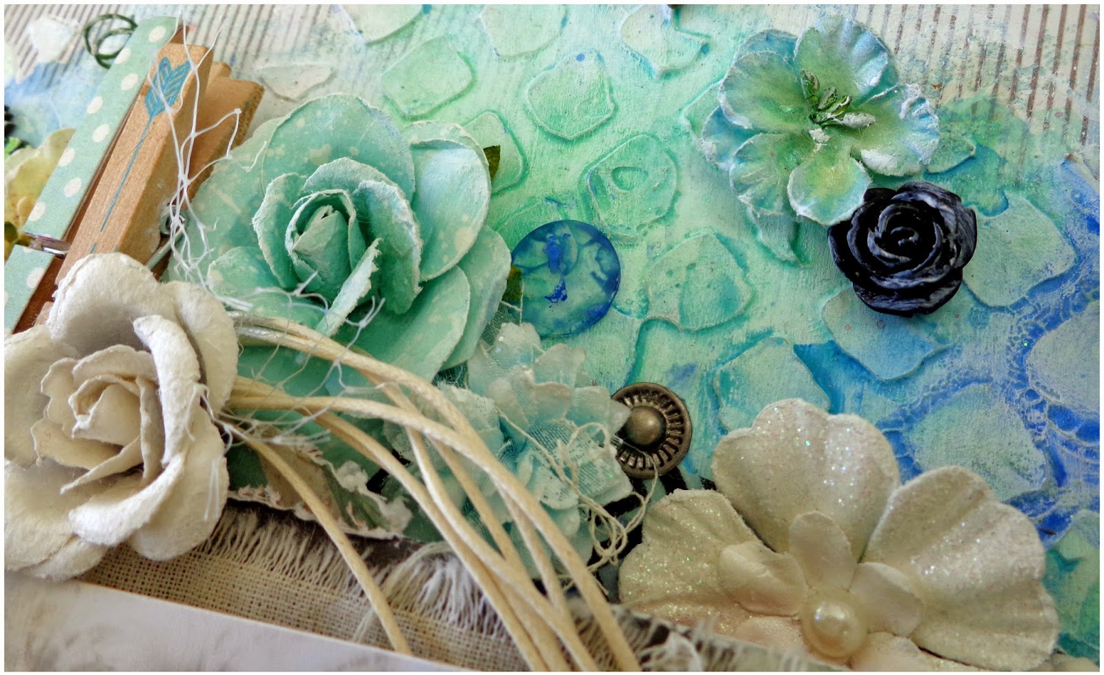
The circles in my background, are actually some different sized washers that I have had sitting in my stash for quite a while. I just pushed them into wet texture paste/gesso, then scraped some more gesso over the top with my palette knife. When it was dry I painted them with my watercolors, adding the little blue roses to the two bigger ones at the top and bottom of the page.


---------------------------------------------------------------------------------------------------------------------------


Finally I want to quickly share with you a card that I made recently, which was actually inspired by the brownish tones that I used in the layout above. I have never created a brown card before, and this would have to be the first thing I have ever created that is not full of bulky paper layers. I wasn't really sure how it would turn out, but I really love this card!! It's actually one of my fave's!!!!!

'Happiness'


I have used quite a few mixed-media techniques in the background, though I must confess I'm not entirely sure why I bothered with some as i have mostly covered them up!!!! However I am certain that if I hadn't bothered, my card would not have ended up looking like this!!!!


That's all from me today. Once again I am sorry for my absence around here lately, and hopefully things will start to get back on track now. I certainly hope so as I have so much that I am just dying to share with you. Thanks for stopping by! I hope you found some inspiration for the weekend!!! Hugs!!