'I Love You'
I have mostly used a combination of Kaisercraft, and My Minds Eye papers, Prima flowers and embellishments and Dusty Attic chipboard, though there are some other brands in there too!!!
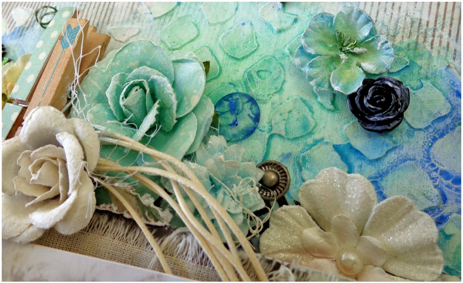
My background was created using gesso, my fave Prima stencil and texture paste, gelatos and watercolor paints.
Some details:
Here I have added some stunning Prima flowers and embellishments amongst the layers of my banner. I have left the loose threads from the calico (behind my photo) wherever they fell on the page, and added some netting around the embellishments for extra texture.
I have used 2 of the same Dusty Attic Chipboard frames here. Both have been painted white with gesso, then colored in with gelatos and blended with water. The first frame was placed on the background, tucked beneath the top of the banner, whilst the second was placed on top of my photo, just above it.
My title, 'I Love You' was cut from some My Minds Eye paper and placed on top of the frame. It was a perfect match for the banner!!!
Because of the dimension and space between the layers of my banner, I felt that the bottom of it looked a little odd, so once again I have tucked an assortment of embellishments amongst the layers.
I have sanded the edges of my photo, and brushed the edges of all my flowers with gesso to add to the shabby feel of this layout.
Where my banner meets the edge of the page here I have placed along the top of it some Dusty Attic Chipboard barbed wire, painted white with gesso, and layered together in 2 different sizes. The chipboard arrow has simply been colored with a black marked.
Here you can see some of the awesome effects of using watercolor paints on top of gelatos that have been blended with water.
For the chipboard scroll below, also by Dusty Attic i have used the exact same technique for coloring it that I did when creating my layout 'She Is A Delight'. I even used the same flower to decorate it!!!! You can see the tutorial for this layout here. Just scroll down to see the steps for coloring the chipboard.
The birdcage I have used is by Tim Holtz. I have removed the back from it so you can still see the paper in the background. The metal backing was just a little too grungy for me. I have shabbied it up with gesso, and a butterfly, before suspending it from some twine.
For finishing touches on the page I added some enamel dots and glitter dots, randomly placed around the page.
I really hope you enjoyed this post, and that this layout inspires you as much as it does me. I'm off to do some creating!!!! I hope you all enjoy the rest of the week, and that you find time to do the same!! Thanks for stopping by!!!
Hugs!!


No comments:
Post a Comment
Thanx for stopping by and for taking the time to leave your lovely comments.... xoxox!!!